So yesterday I was talking to my fantastic friend STEPHEN who reads this blog, and he said that I should put in more details and descriptions of how I do things. I think sometimes these processes seem obvious to me, or I do them more intuitively than analytically, so I’d never really thought about doing something more step-by-step like that before. So, without further ado, a More Detailed Look at how I created this digital illustration in Photoshop.

This is an illustration based on a reinterpretation of the hymn,
“Lo, He Comes With Clouds Descending” by Jonathan Green. We met up yesterday and had a stimulating talk about electronica (Björk and The Knife!) and the intersection of visual and audio art – among other things. Anyway, he left me an album he’d made, and after listening to it for a while I got to thinking about how I might visually represent this rather gritty track, which stuck out to me.
First I decided to work digitally rather than with ‘real’ materials, since the song is so synthesized and contains a ton of artificially-generated textures and sounds. I also decided on two colors that really stood out to me from a few listens: a sort of grey-green-greasy army-fatigues color, and a harsh, El Grecesque acid yellow.

Then I thought about imagery. I have a print that I made my sophomore year of an angelic figure and decided to use it as the basis of piece. It uses a lot of radiating lines and is somewhat of a favorite of mine, but it isn’t framed or anything and doesn’t get out much.

Then I started thinking about the nature of sound(!) music programming, and how I could bring in a feel of these digitally-created textures and sound patterns. I thought of bringing in little digibit-shapes like the MIDI sequencer in Garage Band


but ultimately decided to go with something more like sound waves or sine-waves. I build them by creating some random shapes with the Lasso tool and then warping them repeatedly using the various Distort filters until I had an nice curvy wave shape [not pictured]. Then I duplicated this and distorted it some more to give an idea of the dark, minor feel of the song, and the timbre of the bassline at the opening. (Not that the song is especially dark or destructed by the standards of electronic music, but minor keys are an interesting feature of a lot of hymns that isn’t reproduced much in contemporary worship music, and I liked how this was carried forward in Jon’s re-do. The dark musical elements stood out to me so I wanted to emphasize that in the work.)
ANYWAY I arranged the ‘waves’ in a repeating sequence and then applied a further filter from left to right so that the sequence would show change and progression (ie.
1st wave: not filtered, 2nd: filtered once, 3rd: filtered twice, etc.). You can see the degrading of the wave quality at the bottom of this shot:

At this time I also incorporated a bit of a glow around the figure’s head, using both photoshop brushes set very Soft, and some effected scans of ink splashes on Yupo, a plastic paper (“paper”) which preserves the pigment texture of watercolor really well since th eliquid has to evaporate vertically off the surface rather than being absorbed into the paper body and blurring the pigment grain as it does so, and which I often use for “real paint” effects that I can scan and use as textures in Photoshop.
At this point I had the angel and a lot of yellow squiggles, so the image wasn’t very high contrast; I needed to bring in some darkness and drama. I brought in another watercolor/ink scan

and played around with it a little, duplicating it, inverting parts of the color so that I could get the right balance of black+white in different parts of the picture, and applying various blending effects from my Layers palette, as well as adjusting the color with Hue/Saturation so that the red in the original was a nice yellow that went along with my color theme.

Here’s the yellow effects combined with the ink scans (the angel layer is still turned off so you can see what’s going on elsewhere, although when I’m actually working I leave all the layers turned on, usually, because Blending effects depend largely on what other layers the effected layer is interacting with…if that makes sense).

It still lacked depth so I added a large, transparent layer of red over everything, faded in some areas like around the angel’s head. (Around this time I switched the main color scheme from green+yellow to red+yellow. Originally this layer was green, but it seemed too underwatery and not celestial enough(?).

 Alternate green version
I wanted to add some gold as a halo, and looked around to see what scans of gold I had. I found a section of Resurrection Rabbit and thought incorporating the flowers would be interesting too. Using Polygonal Lasso, I chopped out a jagged crop of the flower area that combined the sinuous motion of the plant with the energy of a lightning bolt. Using the same original layer, I chopped out a different variation of the jagged edges and multiplied them over each other (using Difference to make sure they lined up exactly) for a richer effect.
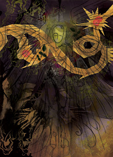
That looked cool, but now the lightning/roses were the focal point and the figure was getting lost. I snipped out some body parts from magazines and scanned them in to create a composite, Michelangeline body.

[Other layers removed for a better view of the body and how roses/lightning turned out]
I submerged most of the body under a few other layers, but left the left hand on top so that it would really pop. I gave it a little benedictive flame. The angel print was still not really holding its own so I duplicated the [already Multiplied] layer and offset it a tiny bit to give it some movement.
Around this time I added some other details which are pretty subtle but help pull it together – for isntance: Even though the feel of the song is pretty minor, and the second coming of Christ will be pretty dramatic, I felt that the piece overall was a little dark and I wanted more light to be shining down from heaven on the figure. So, again using Polygonal Lasso, <3, I created a jagged, lightningish burst of light coming down and illuminating the space a little bit. I duplicated this and assigned Overlay and Saturation to the layers, respectively, to tone them down a little bit – I wanted them to add ambience, not really be seen.

Made final tweaks to color richness and such, and DONE.


 Alternate green version


 Posts
Posts


