Friday, February 29, 2008

Solitaire


A further idea for Silver Worlds; elaborating on the 'empty heaven' idea from last post.

I'm thinking this would be nice as a 1.5'x3' or so. I kind of like working on multiple, joined panels.

Sound of Silver


This is a piece I'm donating to Montserrat College of Art's Artrageous fundraiser, a juried auction/show. I'm a little sad to give it up, after working on it (on + off) for three years (I know!!) but hopefully it will be selected by the jury and get some good publicity. And I suppose supporting education is always a worthwhile contribution. The colors on these black ones have inevitably become warped in the uploading process, but if you click to view larger they look a little better.

Here it is from an angle so you can see the framing. I gilded (silvered? :s) the inside lip of the frame to produce an intimate little mirrored enclosure. Thanks Tim for technical expertise!!!!

Just for kicks here's the painting with the creatures (very hurriedly) photoshopped out. Actually a really helpful step that got me thinking about different compositional possibilities in the series.

Sketches for Silver Worlds series.
In an effort to be more focusing I'm going to be selecting a few pieces in the coming days and expanding them into series of about 1-0 pieces each - maybe I will choose ten types and thus have 100 artworks. We'll see. When I'm 28 or 29 I'll be able to have a show :P
The Silver Worlds idea is exciting I think because it will lend itself to a lot of permutations: space, underwater, caves(?) - obviously they don't all need to be set in naturally dark environments either.
From The Vault

Cicada God from large Moleskin, about a year ago. See The Space Trilogy, C.S. Lewis

Tuesday, February 26, 2008

More Narnia Stuff


Hmmm...posting images isn't working so well today (it's been a bad day for the internet :P ). So all I can post is this, which was meant to be the 3rd in a three-pictures series.

Semi-final Stillpoint illustration for Venus/The Magician's Nephew.

Monday, February 25, 2008

...And Then My Emotions Manifested Themselves In The Form Of An Enormous Rabbit.


Rabbit In Action

Something I'm planning on doing as I prepare to go large. 70" x "80 or so.

Saturday, February 23, 2008

How To Talk About Your Work

I attended a lecture/Q+A session this morning with curator/critic Barbara O'Brien, former editor of ArtNewEngland this morning. It was the third talk I've attended of hers (once when she introduced her exhibit Standing On One Foot at Gordon College, and another time with the art critic Donald Kuspit as Simmons College, where she now teaches). I'm been impressed each time by her sensitivity; usually I think of The Art World as a very scary and brittle political space with a clandestine sense of manners; a single wrong move can you booted or blacklisted. Barbara O'B., though, always communicates a sense of humanity and reverence, if you will, for the artist as person, and their work as an essential aspect of that. I like that.

Her talk today was on presenting your work to curators and galleries; the public, business side of being an artist. She said, interestingly, that in an artist's statement she doesn't necessary want to find out about the conceptual or emotional trappings of a work; she wants first to connect to the work on a physical level, on the level of materials and practice - and then discover its meaning later for herself. I love that; as for me the original meaning of the artwork is not something that the audience necessarily needs to know to appreciate it. I don't want my art to speak for itself necessarily (of course we could spend a long time unpacking exactly what that means), but rather to present a unified sybolic matrix that the viewer can extrapolate from. My repetition of rabbits, birds, metal leaf placement, etc. is meant to evoke a series of connections that will give viewers spaces to build their own narrative connections on. Time and time again the things that people tell me they see or 'understand' from looking at the paintings are widely divergent from my own initial understanding of the work, and while showing the work in progress, my continued work on a piece has often been influenced by what viewers have said. So in that sense, I would say that the work is collaborative.

Umm...trying to reunite this thought-train...in the end I got to talk to Ms. O'Brien for about thirty seconds. I've introduced myself every time I've met her, but of course she doesn't remember me :). She asked me about my work and I found myself telling her about my senior thesis work from two years ago, which is still important to me but not really the most logical thing to be telling a curator about, esp. since it's scattered and sold now. Immediately after she wished me the best of luck and walked away, I realized that I should have said something like, "I work on a small-to-medium scale with acrylic and precious metals, using a decorative, Southeast Asian aesthetic and animal imagery to intimately communicate a sense of simultaneous power, threat and vulnerability." Oh well...next time. We are only succinct in our own heads I guess.

P.S. After my Barbara blunder, another artist I know invited me to submit to an invitation-only juried exhibit, which I'm really excited about! The deadline's coming up though (they always are) so i'll need to get cracking to have my piece in.

Friday, February 22, 2008

Sneak Peek

I've doing some illustration for the new issue of Stillpoint magazine - there's an article on Michael Ward's new book Planet Narnia, which draws parallels between the Chronicales of Narnia and medieval astrology of the planets. Here's a sneak peek:
My sketch for the sun (yeah, this a pre-Copernican cosmology where we were still at the center and they thought the sun was a planet).

And the final. It was originally going to be yellower, but I ended up putting in the ocean... Some of them will be more straightforward images of planets (like Jupiter), while others like this will more Narnia-themed snowglobes, showing events and symbols from one of the books.
I highly recommend Planet Narnia; I read/skimmed it for research and it is fascinating. For really.

Thursday, February 21, 2008

Ex Nihilo Rears Its Head


detail from Ex Nihilo: Birds of Prey, walnut ink and watercolor on Arches Cover Buff, 22" x 15", 2005. Collection of Bryan and Natalie Parys.

So three years after my best-selling-yet series Ex Nihilo, I am still getting comments about it, and how much people wished it was still going on. Never one to rain down sorrow when I could be dispensing joy, I am going back to the grindstone with a huge sumi brush, my trusty Arches Cover Buff, and that gem of art supplies, Walnut Ink. It practically does the painting for you. Process pictures to follow.

From The Vault


Here's something in Walnut; a picture of Bruce Herman working on his Mary murals in the bottom of the Torre del Moro, Orvieto, Spring 05. Originally to be included in Gordon College's Stillpoint magazine...and then not. Such is the publishing industry.

Highlighted with white watercolor. Probably about 4" x 6".

Ciao tutti.

Wednesday, February 20, 2008

The Vault Opens

No new photos from the studio today, although I did get some work done on Now It's Starting To Spread!, which is coming along nicely. Added some darker values and moved onto the central panel of the triptych.

From The Vault
I'm including extra Vault today to compensate for the lack of current images.


A map for my probably-never-to-be-completed children's book, Animal Kingdom 'GoodLand'.


A page form my stylebook, where I clip'n'collect images from notes I take (most of these are from high school when I drew intead of taking notes in all my classes). It's sort of a Grant Hanna version of Mucha's Documents Decoratifs. I think these are mostly from a politcal studies class I took sophomore year of college.


Here's an old scan of the top section of The Green Bird, before I solved the anatomical issues.

Tuesday, February 19, 2008

Now It's Starting To Spread!

Here's a picture of me in my studio (working on Now It's Starting To Spread!) tonight.


Now It's Starting To Spread!, left panel of triptych, 16" x 20", acrylic, 2007 -
A pelican with a bleeding breast. To those disturbed, the pelican is a symbol of Christ in Christian iconography; it was beleived medievally that mother pelicans would peck their own breasts in times of famine and feed their blood to their young.


Study of an Arm from yesterday. The changes are pretty subtle but I've working up the values with a lot of glazing and just having fun mixing slight color variations. Microtonal glissandi as I like to think of them:)

Finally, here's a late/early version of a piece I've been working on/not working on for almost a year. As you can see, there are many layers; I've started 4 or 5 paintings on this poor guy. Tonight I was looking at it and suddenly the figure popped out at me, marble-speaking-to-Michelangelo style, so I put in some time with it. The pose is somewhat similar to the Druid in Fergus and the Druid, and since the Druid is somewhat like Nereus, always changing (just like this painting!), I might have it be a further figure study of the Druid, going more into the jagged, Yoshitoshi-like lines I've been wokring up. Given the complex nature of the background, I might leave it more as a study. That's a lesson I'm trying to learn - when I need to let something go and not obsess over having it be "finished."

Sweet dreams, everyone. I'm going to bed early(ier) tonight. Which means ideally before 12!

The Green Bird


The Green Bird, acrylic on panel, in progress, 12" x "24 (?), fall 2004 - present

From The Vault


Drawn in a Moleskin about a year ago.

Monday, February 18, 2008

What A Good Monday


I have a few things to put up - I had a nice time at the studio tonight and got a lot done. Because I work with a lot of layers I usually do a little bit each on 5-6 pieces every time I go in; that way each can dry while I work on the others. Above is a study of an arm that I'm working on - don't know how well it will translate to the web; I'm doing it all in white, because I think it will be fun :) and probably help develop some color sensitivity.

This one's a figure study for a painting I'm working on based on Fergus and the Druid, by W.B. Yeats. I've put in the druid already, but the figure of Fergus was very blocky and not that convincing, so I did this sketch before going back into the painting and glazing over my underpainting. (Confusing, I know :P ). Fergus is crouching in the surf on the bleak beach as the druid looms over him.


Here's a photo of the painting. I know, it's a terrible photo. Get used to it:) The color is off and it's fuzzy, but as you can see, I've patched Fergus in as a lavender/white area. I've started to think a lot more about color choices, composing the colorpan of the painting harmoniously, and using color emotively - that is, don't just make a person's skin flesh-colored because "that's how it is" - ask what would communicate the psychology of the painting best. (Thanks Tanja.) So I've put the Druid in as an ochreous color, since he is old, wizened sunburned, like a husk. As first I was thinking of Fergus heroically (in keeping with the really blocky frame of my initial draw of him), and was going to have him be tanned like the Druid. Then when I drew him leaning over, and thought of his words - "Now I have grown nothing, knowing all" - I wanted to make him very ghostlike. Fair Irish skin with a good bit of purple in it and red hair, all to make him appear very wraithlike and juxtapose his sound body with that of the Druid above him, who even though he is frail seems to be in the controlling space of the picture.


I've decided to post something from 'the archives' every post too, so here's a sketch on bulletin, from all the way back in 2003! I was only 20 then! Wow.
I promise I concentrate better on the sermon if I can draw. :D


Rabbits and Bears

This one is a detail of a large watercolor that I started in the summer of 06, and have recently resumed work on after 2 years of doing mostly acrylic painting. I love the effects and depth you can acheive with acrylic, but watercolor and gouache are still my favorite media. I feel totally conmfortable with them and free to explore without worrying about technical issues. I stretched + dyed this paper using heavy washes of watercolor, and now am going back in with watercolor and gouache, and maybe some touches of acrylic later if I really need opaque white effects and the paper has become too pigment-saturated for gouache to go down cleanly.

Rabbit Court, watercolor and gouache on Arches Cover Buff, in progress, 15"x22"

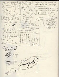
Here's a scan from my sketchbook, probably done about 2 years ago now; in spring of 06. A comic detailing a Eurotrash party I attended in Grantham, Pennsylvania.

Thursday, February 14, 2008

RabbitFueled Revs Up!

It's a blog to post about The Art - what goes on my studio and how it happens.


Here's a picture to get things started.